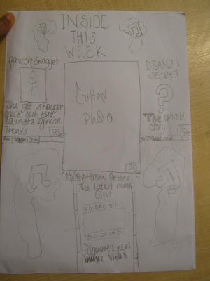
- I put a sun saying photoshop around it as I really enjoyed using and learning new skills in photoshop- layering, merging, lighting and cloning.
- I put a cloud and rain by deadlines as I didn't like having to keep up with the deadlines as it was stressful at times, I believe next time I should do all tasks (homework) as soon as I get it rather than leaving it to last minute.
- I used sun glasses which contained the 4 majors as I was very interested in learning about the 4 majors and the conglomerates and how they work concerning majors and indies and the ways they advertise there artists (tours, music videos etc)
- I put T.V drama near the sun as I liked analysing and gaining an in depth understanding of the clip . I learnt to develop my analytical and evaluating skills.
Year 12 Music Production
Tuesday, 28 June 2011
My Island
Evaluation for task year13
I felt that this task overall went well. I was an actor in this project.I felt we all as a team worked well and came to agreements easily everyone had an equal contribution.
I felt that my contribution overall to the project was good concerning the ideas and shots types we should use throughout the film. I felt that overall the idea and flow of the film was good, I felt that it made sense, we used a lot of shot types such as close shot, long shot, tilt and pan. Which made the film interesting as it varied.
However what I think that would have made it better was if we used a tripod as at times the shots were a bit shakey unintentionally as it was handheld.
Monday, 27 June 2011
Year 13
Task Given: To create a short film based on a meeting of any kind. This task was set to give us practice in filming and editing before we start are actual filming project (coursework) when we return in September, we was given an hour to make videos for this theme as we had four people in are group and are teacher said if we are going to have four people we must create two videos; on e was done with a tripod and the other handheld.
My group was a group of 4 girls, we decided to base it on an actual T.V scenario in the Hills (MTV reality show), where a pair of friends meet up to reeconcile, however one person is more keen to make up than the other and this result in the not reconciling as the keen friend walks off in anger.
We were given rules that we had to follow as we were filming on school premises, the were following:-
- Always ask for permission to film in particular parts of the school
- Get permission from the people you are filmng
- Do not take students out of lessons to film
- Do not access areas that you are not allowed
Monday, 3 January 2011
EVALUATION-What have I learnt about technologies from the process of constructing this product (Contents Page)
EVALUATION-What have I learnt about technologies from the process of constructing this product (Front Cover)
Before
The reason why I prefere this to my first attempt is because I feel that it meet the codes and conventions of a music magazine.
In order to create the front cover I used the Photoshop crop tool to crop out the body an get rid of the background. I then placed the cropped image (as well as my masthead which was also done in Photoshop) into Indesign and placed the text and made the background using colour gradient. I also used special effects on the font such as shadow.
EVALUATION-What have I learnt about technologies from the process of constructing this product (spread sheet)
Before
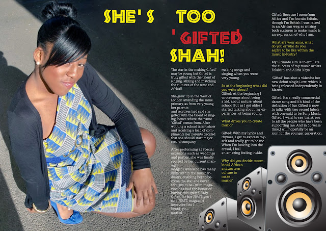 In order to create this I used two software Photoshop and Indesign.
I edited the photo using a variety of tools;I used auto colour in order to darken and enhance the shine in the picture and to also darken the image making the text on top more readable.In order to extend the concrete, making it A4 for my double page spread, I used the polygon lasso tool (a selection tool) which selects an area and replicates it for you, this tool enabled me to extend the image. I used a clone tool which copies areas of a picture and puts them in other areas of an image. I also used a patch tool in order to blend in the concrete, I also took out the gate and wall as I felt that it was a distraction for my desired look, I wanted it to appear that light is shining on her from above to emphasise on her being special.

I edited the photo using a variety of tools;I used auto colour in order to darken and enhance the shine in the picture and to also darken the image making the text on top more readable.In order to extend the concrete, making it A4 for my double page spread, I used the polygon lasso tool (a selection tool) which selects an area and replicates it for you, this tool enabled me to extend the image. I used a clone tool which copies areas of a picture and puts them in other areas of an image. I also used a patch tool in order to blend in the concrete, I also took out the gate and wall as I felt that it was a distraction for my desired look, I wanted it to appear that light is shining on her from above to emphasise on her being special.
Sunday, 2 January 2011
EVALUATION QUESTION-What have I learnt about technologies from the process of constructing this product
Throughout my production of magazine I have used software such as Abode Indesign and Photoshop.
Indesign is a desktop publishing software allows you to layout your files made in photoshop and text with them the way you want it.The benefits of Indesign is that it gives you outlines of columns, you are also able to put the text in the columns where you want it to be and are less restricted compared to other software similar such as Pages. This is an ideal software for magazine production as you can also put pages of the whole magazines in the software as well.
Photoshop is very good to use concerning magazines through this software you are able to place images and text via layers which lock down images and text layer by layer so there is no interference between each graphic allowing you more freedom to be creative.You are also able to change the colour tone of the picture, there is also a large variety of fonts provided as well as many effects to the picture as well such as bubble wrap shadow etc. As I talk and discuss each product I will elaborate on the effectiveness of Photoshop.


Saturday, 1 January 2011
My First attempt to create a music magazine
.
Another thing that I noticed was that in my magazine there is settings however most music magazines, if not all, always have a plain coloured or gradient effect background.
So I then did another one which met these conventions.
Thursday, 9 December 2010
EVALUATION QUESTION-In what ways does your music magazine use, develop or challenge forms and conventions of real music magazines?
Having chosen the genre of African RnB for my music magazine, currently there are no established African RnB magazines so for my research I have decided to look at magazines such as VIBE (hip hop genre) and Billboard as these are the closest genre to my chosen genre.
Having researched the following magazines (VIBE and Billboard), my magazine has the following:-
- date
- issue
- barcode
- price
- masthead
- strap line
- lures
- cover lines
- mode of address
- a mid shot image on the front cover
- one colour or gradient colour background
My magazine has a consistency of style keeping the African culture throughout the whole of the magazine; I have stuck to the colour scheme of red, green, as well as using similar fonts Caecilia and African throughout the magazine which is what real music magazines do.
I also have a gradient background as most magazines concerning my genre of music have, 2 fonts and 2 colours maximum used throughout my front cover.I have also noticed through my research that on front covers there are either close ups or mid-shots of music artists and this I also have on my front cover.
I also have a gradient background as most magazines concerning my genre of music have, 2 fonts and 2 colours maximum used throughout my front cover.I have also noticed through my research that on front covers there are either close ups or mid-shots of music artists and this I also have on my front cover.

On my contents page I have used page references as well having pictures on the page as this is what I found real music magazines do, they usually .I have an image on the contents page which all music magazines have.
I have used three to four columns on my double page spread for my music magazine as from my research I have gathered that most music magazines used 3-4 columns on double page spreads about music artists, they also usually have an image of the artist on one side of the page as I have done as well. I also put a strapline near the top of the page near the text as this is what magazines usually do.


The way my music magazine challenges codes and conventions is through my masthead; its is not plain compared to others such as VIBE their font is plan and simple yet mine has lines mine also has different colour text where very few have.
EVALUATION QUESTION-How does your media product represent particular social groups, how are you appealing to the youth culture?
I am appealing to the youth culture by using vibrant colours such yellow, green and red to appeal to the culture of youths. It is said that these colours represent the life of a youth: fun, care-free, busy. For example magazines such as Top Of The Pops.
As you can see there are a lot of vibrant colours (Pink and Yellow), this is similar to my magazine, I have managed to adapt African culture through the colours as well as being appealing to young people; as luckily the colours connotes with Africa are bright. I have also used curvy fonts (like the magazine above) as I believe it represents a life of a youth: fun and different. Rather than plain and straight fonts with dull colours such as black, grey etc (which appeals more to 26+).
Predominantly African people with in the UK are working class so I believe the fact that my magazine is Africa inspired it means that inevitably I am representing the working class through my magazine.
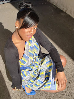
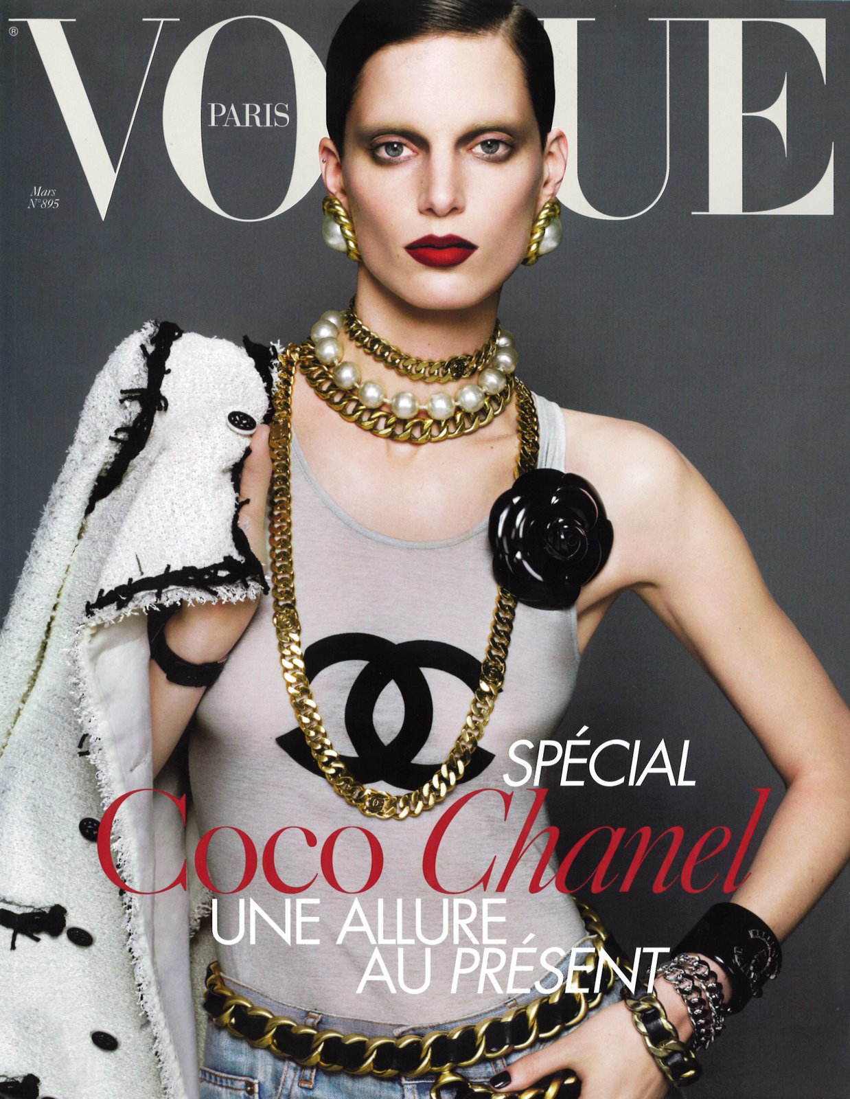
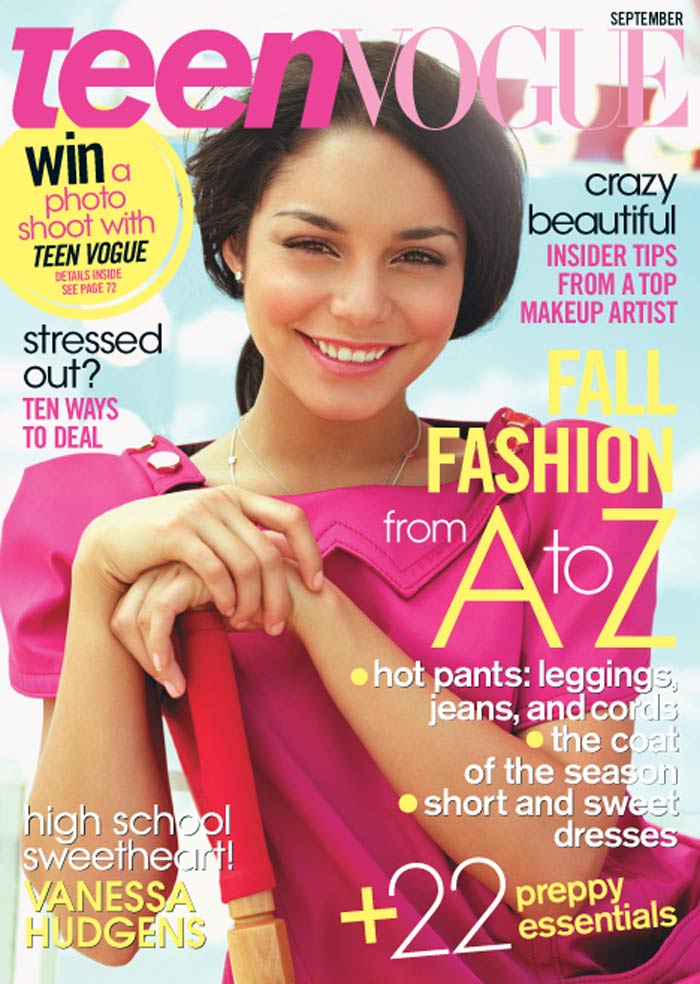
I have pacifically chosen an African who is 19 and a female as well because firstly, my magazine is based on African culture and my target audience is within the ages of 16-19 years so using someone with in this age range will apply more to my age range as she is one them for example if we look at the magazine Vogue; there is Vogue and Teen Vogue. Teen Vogue (with teenage models) was created to appeal to teenagers and this is what I have done as well I have used someone within the age range that I am targeting to appeal to them more.
I have pacifically chosen an African who is 19 and a female as well because firstly, my magazine is based on African culture and my target audience is within the ages of 16-19 years so using someone with in this age range will apply more to my age range as she is one them for example if we look at the magazine Vogue; there is Vogue and Teen Vogue. Teen Vogue (with teenage models) was created to appeal to teenagers and this is what I have done as well I have used someone within the age range that I am targeting to appeal to them more.
EVALUATION QUESTION-How did you attract/ address the audience for your music publication?
As I said previously my target audience are Africans so I use various strategies in order to relate with Africans. I address my audience by using colours are often connoted with Africa such as red, green and yellow or green and white (Nigeria).Not only that I use West African colloquial language which is often referred to as pidgin English; I have done this in order to relate to my potential readers, this will then make them more inclined into buying my magazine as they feel it is about them, their culture and their people. The name of my magazine 'DRUM' is also an inference to African music as drums are the basis of our music, I have used a font containing lines and curves this relates to Africa as within the textile industry materials often have patterns containing stripes and curves. The line with in font also refers to the strings that are on an African drum. This amount of detail in relation to Africa conveys and passes the culture through the magazine this then attracts African people to the magazine as it takes them back to their homeland reminiscing and seeing the best of African music and culture within my magazine.
I will publicise my magazine within places such as Hackney and Islington where there is a huge population of Africans. I will then target corner shops within these areas where I will sell my new magazine. I will advertise my magazine using T.V programmes that a lot of African people watch such as AIT-African International Television. I will promote my magazine on African music websites such as www.naijamusic.net and put posters advertising my magazine in the areas which I mentioned before. In order to even furthermore attract my potential customers I will give away a free authentic African bead bracelet
Wednesday, 8 December 2010
Prelim task-Content page analysis
I have the mast head to keep a consistency through the magazine.
I've also used same fonts as the one on the front cover to also keep consistency throughout the magazine as this is what professional magazines do.
There are pictures of the school and students of the school as this is a school magazine.
I have used bright colours in the magazine as this represents the life in a youth.
However, I feel that there is too much white and this not professional enough for a magazine.
Magazine Price research

Price: £3.85
Price £2.25
Price £3.25
From researching other magazines similar to mine; I own I have now decided to sell my magazine at £2.50; I have not made the rice on the higher end of the scale as I am a new magazine and I therefore want to attract people to my magazine and not have them put off by the price.
Ideas For Headlines and mastheads
Here are some ideas of mastheads. My first name for my music magazine was 'Exclusive' as my news will be exclusive from Africa; however I felt that this did not really represent the genre and the content of my magazine, so I came up with the name of 'Drum'as this is the basis of African music and also has a strong connotation with Africa therefore making it an ideal name.
My first, second and fourth masthead I have used a distorted font with green, white, yellow and white these colours connotes with Africa, this was done to represent the genre of the magazine however I felt it did not relate the research in mastheads in which I have done.
So I have chosen the third masthead as the curves relates well to established magazines such as VIBE and Billboard; which inevitably represent the style of music I am promoting; the lines in the font (atlas) also reminds me of the string of an African drum which again relates to my genre of music as well as the title within itself.
Idea 1
Drum....
Gives You The Deal
On The Begining
Gifted
Idea 2
Drum... Presents
Gifted
Idea 3
Drumroll.....
Presents Gifted our sister from Africa
I have chosen to go with idea 3 as I like the manipulation of the name of my magazine, also the common reference to people from Africa as sister or brother really portrays the African culture that I want to promote in my magazine
Research in straplines
Here are music magazines that are similar to the type of genre my music magazine promotes. As u can see the strap lines usually contains music artists name on the front cover it is larger compared to the other names. So this is what I will take and adapt to my music magazine. Not only that the straplines usually give little hinters of what is the content of the magazine for example Vibe says 'Rhianna:Exposed.' Tells me that a secret will be exposed. This I have also adapted in my magazine when doing strap lines for example on my music magazine it states 'D'Banj-The untold story.' The second part of the phrase attracts the audience to the magazine as they become curious of the topic; just as 'Rihanna: Exposed' Lures in the readers.
Tuesday, 7 December 2010
My photos for DRUM Magazine
Photo shoot organisation
Picture 1
Landscape-midshot. Model must be wearing African attire and will be sitting on a sofa posing as if she is dancing and having fun.
Picture 2
Landscape- midshot. Model must be wearing african attire and will be hanging from railing whilst smiling appearing as she is fun.
Picture 3
Close up on whole body with face being the main focus, sun must be shining on her body, again smiling.
Picture 4
Posing with scarf against a wall. Long shot image.
Picture 5
Long shot, land scape. whole body in shot, she should be crouching down looking directly into camera with a smaile on her face.
Thursday, 25 November 2010
Semi Otics- Analysis

This picture is a close up shot, the main focus is the wedding ring, this is an indexical sign as it indicates that he is married, it is also a symbol as the circle represents eternal love. Another sign to the ring concerning the indexical sign, is that the ring is a indication that he is no longer on the market, he is now in a committed relationship. The ring can also be an iconic sign as weddings are usually connote to church, so this is a religious sign.
The watch is also an indexical sign as the watch looks very expensive so the watch acts as an indicator of his wealth.
His tattoo of a star can act as a symbol for his that he is a superstar!
Semi Otics
This picture is a close up shot, the main focus is the wedding ring, this is an indexical sign as it indicates that he is married, it is also a symbol as the circle represents eternal love. Another sign to the ring concerning the indexical sign, is that the ring is an indication that he is no longer on the market, he is now in a committed relationship. The ring can also be an iconic sign as weddings are usually connote to church, so this is a religious sign.
The watch is also an indexical sign as the watch looks very expensive so the watch acts as an indicator of his wealth.
His tattoo of a star can act as a symbol for his that he is a superstar!
Example:-
.jpg)
Iconic signs: are like religious paintings, statues and stained glass windows found in churches. It could also be famous people or people of high power- these people are refered to icons.
Example 1:-

Example 2:-

Indexical Signs: signs that have some kind of direct connection with what is being signified . E.g. Smoke signifies fire. Indexical signs are 'indicators.'

The watch is also an indexical sign as the watch looks very expensive so the watch acts as an indicator of his wealth.
His tattoo of a star can act as a symbol for his that he is a superstar!
Semiotics: The Science Of Signs (the understanding of why we use signs)- an attempt to create a science of the study of sign systems and their role in the construction and reconstruction of meaning in media text.
Signs: Consists of a signifier has an idea/ meaning behind the set of images
There are 3 different types of signs:-
Symbol: A sign that represents an object or concept solely by the agreement of the people who use it.
Signs: Consists of a signifier has an idea/ meaning behind the set of images
There are 3 different types of signs:-
Symbol: A sign that represents an object or concept solely by the agreement of the people who use it.
Example:-
.jpg)
Iconic signs: are like religious paintings, statues and stained glass windows found in churches. It could also be famous people or people of high power- these people are refered to icons.
Example 1:-

Example 2:-

Indexical Signs: signs that have some kind of direct connection with what is being signified . E.g. Smoke signifies fire. Indexical signs are 'indicators.'

This shows me how I must consider this in the pictures that I take. As I am creating a magazine on the basis of African Cultural music it essential to convey this to a person so that even without the text they can know all about my magazine, I want to use essential semi otics that will relate with an African, which inevitably attract them to my magazine. So therefore I have decided that the person on the front cover must be African clothes acting as an indexical; indicating that she is an African.
Wednesday, 24 November 2010
Drum- Magazine
As my chosen genre is African RnB, due to the scarce of African RnB magazine; I have chosen magazines such as Billboard and Vibe, which are the closest type of magazines to my chosen genre, in order to gain inspiration and guidance on how I can create a magazine related to the R N B side. I will then entwine Nigerian colloquial language (pidgen English) to represent the African side of African R N B
Two page spread of mix and mag analysis
Lighting and colour
The first half of the spread uses natural lighting; however the second half of the spread uses flash in order for the clothes to be more visible to attract the reader’s attention, the use of flash and the white background is used to enhance the advertisement of clothes
Camera angle/ shot/ facial expression/ body language
- Right shot angle
- It covers a range of ethnicity (black,white asian)
- It covers both genders ( two boys and one girl standing in the middle)
The fact that there is a range of ethnicities and both genders shows the beliefs of those who are in control of the magazine that they believe in equality no matter gender nor race.
- the girl in the middle looks directly at the camera but the two boys aren’t (expand-what could this mean)
Costume and props
The designer outfits on each model
Setting
Set in alley way which makes it look their standing outside a night club, which relate to the magazines target market (young people and those who like to go clubbing etc.)
Iconography
The looks of the models compliments the clothing and makes people want to buy their outfits as they look fashionable with them on.
(This picture is scanned in)
Tuesday, 23 November 2010
EVALUATION QUESTION-Who would be the audience for your music magazine?
My target Audience are between ages 16-19 years as I will be doing African RnB my main target audience are African people however African music is also currently becoming popular amongst Afro- Carribeans, so though I will be targetting Africans, Afro- carribeans may be interested as well.
My magazine contains only African music artists, it will regulary inform it's readers of the latests African songs and the new and upcoming artists. It will also have the latest news on the artists lives according to the gratifications theory my readers will be satisfied through knowing the latest songs as usually african music comes out in Africa first then the west, by having this magazine I will be giving them the advantage of knowing the latest music and artists before it comes to the UK, giving them the satisfaction of surveillance but not only that by giving them the heads up of the latest music they'll feel important by having the exclusive knowledge on it before anyone else. The latest news on different music artists will give the readers a Diversion satisfaction. My magazine also relates with my audience as in my magazines I will be having the latest fashions concerning African attire and hairstyles as these are the topics that afro-Caribbean are stereotyped as having high involvement in.
The type of products and services that I will be advertising in my magazines are body lotions, hair products and African clothing boutiques the latest designer brands such as Nike, Adidas and other designer brands as these are desired by my target audience.
Age range: 16-19 years
Gender target: Male and Female
Target Ethnicity: Afro-Caribbean
Occupation: Student
Demographic: C2DE
Technology ownership:-

Favourite TV channels: Black Entertainment Tv, AIT (african channel), BBC, OBE (african channel), MTV and Entertainment TV


Favourite clothes shop: New Look, Top shop, River Island etc


Personality: Bubbly, outgoing etc
Where they buy their music
iTunes
Limewire
How much they spend
Maximum £14.99
Do they go concerts?
Yes, occasionally
How do they listen to music?
Youtube
Ipod
My magazine contains only African music artists, it will regulary inform it's readers of the latests African songs and the new and upcoming artists. It will also have the latest news on the artists lives according to the gratifications theory my readers will be satisfied through knowing the latest songs as usually african music comes out in Africa first then the west, by having this magazine I will be giving them the advantage of knowing the latest music and artists before it comes to the UK, giving them the satisfaction of surveillance but not only that by giving them the heads up of the latest music they'll feel important by having the exclusive knowledge on it before anyone else. The latest news on different music artists will give the readers a Diversion satisfaction. My magazine also relates with my audience as in my magazines I will be having the latest fashions concerning African attire and hairstyles as these are the topics that afro-Caribbean are stereotyped as having high involvement in.
The type of products and services that I will be advertising in my magazines are body lotions, hair products and African clothing boutiques the latest designer brands such as Nike, Adidas and other designer brands as these are desired by my target audience.
Age range: 16-19 years
Gender target: Male and Female
Target Ethnicity: Afro-Caribbean
Occupation: Student
Demographic: C2DE
Technology ownership:-
- Computer ownership
- CD player
- Ipod
- Satellite/Cable TV

Favourite TV channels: Black Entertainment Tv, AIT (african channel), BBC, OBE (african channel), MTV and Entertainment TV


Favourite clothes shop: New Look, Top shop, River Island etc


Personality: Bubbly, outgoing etc
Where they buy their music
iTunes
Limewire
How much they spend
Maximum £14.99
Do they go concerts?
Yes, occasionally
How do they listen to music?
Youtube
Ipod
Thursday, 18 November 2010
Subscribe to:
Comments (Atom)


