- I put a sun saying photoshop around it as I really enjoyed using and learning new skills in photoshop- layering, merging, lighting and cloning.
- I put a cloud and rain by deadlines as I didn't like having to keep up with the deadlines as it was stressful at times, I believe next time I should do all tasks (homework) as soon as I get it rather than leaving it to last minute.
- I used sun glasses which contained the 4 majors as I was very interested in learning about the 4 majors and the conglomerates and how they work concerning majors and indies and the ways they advertise there artists (tours, music videos etc)
- I put T.V drama near the sun as I liked analysing and gaining an in depth understanding of the clip . I learnt to develop my analytical and evaluating skills.
Tuesday, 28 June 2011
My Island
Evaluation for task year13
I felt that this task overall went well. I was an actor in this project.I felt we all as a team worked well and came to agreements easily everyone had an equal contribution.
I felt that my contribution overall to the project was good concerning the ideas and shots types we should use throughout the film. I felt that overall the idea and flow of the film was good, I felt that it made sense, we used a lot of shot types such as close shot, long shot, tilt and pan. Which made the film interesting as it varied.
However what I think that would have made it better was if we used a tripod as at times the shots were a bit shakey unintentionally as it was handheld.
Monday, 27 June 2011
Year 13
Task Given: To create a short film based on a meeting of any kind. This task was set to give us practice in filming and editing before we start are actual filming project (coursework) when we return in September, we was given an hour to make videos for this theme as we had four people in are group and are teacher said if we are going to have four people we must create two videos; on e was done with a tripod and the other handheld.
My group was a group of 4 girls, we decided to base it on an actual T.V scenario in the Hills (MTV reality show), where a pair of friends meet up to reeconcile, however one person is more keen to make up than the other and this result in the not reconciling as the keen friend walks off in anger.
We were given rules that we had to follow as we were filming on school premises, the were following:-
- Always ask for permission to film in particular parts of the school
- Get permission from the people you are filmng
- Do not take students out of lessons to film
- Do not access areas that you are not allowed
Monday, 3 January 2011
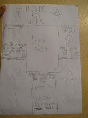
EVALUATION-What have I learnt about technologies from the process of constructing this product (Contents Page)
EVALUATION-What have I learnt about technologies from the process of constructing this product (Front Cover)
Before
The reason why I prefere this to my first attempt is because I feel that it meet the codes and conventions of a music magazine.
In order to create the front cover I used the Photoshop crop tool to crop out the body an get rid of the background. I then placed the cropped image (as well as my masthead which was also done in Photoshop) into Indesign and placed the text and made the background using colour gradient. I also used special effects on the font such as shadow.
EVALUATION-What have I learnt about technologies from the process of constructing this product (spread sheet)
Before
 In order to create this I used two software Photoshop and Indesign.
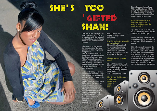
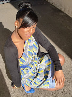
I edited the photo using a variety of tools;I used auto colour in order to darken and enhance the shine in the picture and to also darken the image making the text on top more readable.In order to extend the concrete, making it A4 for my double page spread, I used the polygon lasso tool (a selection tool) which selects an area and replicates it for you, this tool enabled me to extend the image. I used a clone tool which copies areas of a picture and puts them in other areas of an image. I also used a patch tool in order to blend in the concrete, I also took out the gate and wall as I felt that it was a distraction for my desired look, I wanted it to appear that light is shining on her from above to emphasise on her being special.

I edited the photo using a variety of tools;I used auto colour in order to darken and enhance the shine in the picture and to also darken the image making the text on top more readable.In order to extend the concrete, making it A4 for my double page spread, I used the polygon lasso tool (a selection tool) which selects an area and replicates it for you, this tool enabled me to extend the image. I used a clone tool which copies areas of a picture and puts them in other areas of an image. I also used a patch tool in order to blend in the concrete, I also took out the gate and wall as I felt that it was a distraction for my desired look, I wanted it to appear that light is shining on her from above to emphasise on her being special.
Sunday, 2 January 2011
EVALUATION QUESTION-What have I learnt about technologies from the process of constructing this product
Throughout my production of magazine I have used software such as Abode Indesign and Photoshop.
Indesign is a desktop publishing software allows you to layout your files made in photoshop and text with them the way you want it.The benefits of Indesign is that it gives you outlines of columns, you are also able to put the text in the columns where you want it to be and are less restricted compared to other software similar such as Pages. This is an ideal software for magazine production as you can also put pages of the whole magazines in the software as well.
Photoshop is very good to use concerning magazines through this software you are able to place images and text via layers which lock down images and text layer by layer so there is no interference between each graphic allowing you more freedom to be creative.You are also able to change the colour tone of the picture, there is also a large variety of fonts provided as well as many effects to the picture as well such as bubble wrap shadow etc. As I talk and discuss each product I will elaborate on the effectiveness of Photoshop.


Saturday, 1 January 2011
My First attempt to create a music magazine
.
Another thing that I noticed was that in my magazine there is settings however most music magazines, if not all, always have a plain coloured or gradient effect background.
So I then did another one which met these conventions.
Subscribe to:
Comments (Atom)


